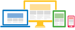
Last week we looked at how to analyze your traffic to get an understanding of which platforms your audience is using to reach you. By comparing the content that your users are accessing via desktop, mobile, and tablet, you'll gain insights into which implementation will best suit your business. In today's post, we'll look at the three most common ways of doing this. We'll explore building a responsively designed site, dynamic serving solutions, and lastly, a separate mobile site.
Responsive Web Design (RWD):
A responsively built site automatically rearranges and resizes content to fit the screen of any device used to access the site. This allows you to optimize the user experience across different devices - without needing to create redirects or make unique pages that cater to each platform. For the user, this means a smooth user journey, and for a content manager, it means content only needs to be updated once. From a developer viewpoint, RWD may require rebuilding your site framework with flexible templates, grids, style sheets and JavaScript but with very rewarding results. Take a look at this case study to see how TowerGate Insurance adapted RWD to increase mobile and tablet users by over 200%.
Dynamic Serving of Content:
Another solution is to dynamically serve content. Similar to RWD, with this approach the web server detects the type of device the visitor is using and presents a custom page on the same URL. This allows for a fully customised device experience, but also means that your content will need to be maintained separately for each platform. To ensure your users have a smooth navigational experience, prioritize building dynamic content for the most popular pages that users are accessing through mobile, and similarly apply the same for tablet.
Separate Mobile Site:
The final implementation you might want to consider is creating a separate mobile site, where smartphone users will be directed to a mobile-optimized version of your site. This implementation allows you fully customise your content for a mobile audience, since it's often an independently hosted solution. Similar to creating dynamic serving content, this means you need to make separate updates for content or styling pieces to ensure a smooth user experience. Take a look at how Adidas reached a winning formula with their dedicated mobile solution.
To read more about what we've discussed today or to find a list of recommended vendors that can help you to develop your mobile solution, check out this article by the Google Think Insights team. Also, join us next week when we're going to take a look at how you can best use AdSense to monetize your mobile sites.
Posted by Federico Gomez Kodela - Mobile Specialist
Was this blog post useful? Share your feedback with us.
--
Unable to view the links or images in the message above? Want to comment on this post? Visit http://adsense.blogspot.com/ .
You received this message because you are subscribed to the Google Groups "Inside AdSense" group.
To unsubscribe from this group, send email to Inside-AdSense+unsubscribe@googlegroups.com
For more options, visit this group at http://groups.google.com/group/Inside-AdSense
---
You received this message because you are subscribed to the Google Groups "Inside AdSense" group.
To unsubscribe from this group and stop receiving emails from it, send an email to inside-adsense+unsubscribe@googlegroups.com.
For more options, visit https://groups.google.com/groups/opt_out.
No comments:
Post a Comment